Why Colour Matters in the Workplace

Why Colour Matters in the Workplace:

Most of us have heard about how colours can affect our mood at work, but not many of us really understand how. I’ll admit, I’m one of those. But here’s the thing: colours do more than just change how we feel. They can actually boost productivity, improve customer experiences, and even spark creativity. It’s worth taking a bit of time to think about in the workplace more.
BLUE💙
Blue is everyone’s favourite for a reason—it’s super productive! There are tons of shades to choose from, so you can go vibrant or calming. Blue can really help keep your workspace chill, but watch out for shades that might feel a bit sad or cold. Mixing in warm tones or pairing blues with browns or greens keeps things balanced and appealing for everyone in the workplace.
GREEN💚
Green is like a breath of fresh air in the office! It’s the colour of nature, growth, and renewal, and it’s great for sparking creativity and new ideas.Workplace Just like blue, lighter shades of green can help keep things calm and balanced, reducing anxiety. And here’s a bonus: green is easy on the eyes, perfect for those long days at work in the workplace.
RED❤️
 
Red is like a burst of energy in the office! It’s vibrant and warm, making the environment feel alive. Studies even show that it can increase blood flow, heart rate, and brain activity. But, it’s important to find the right balance. While red can boost energy and motivation, too much of it can lead to competition instead of collaboration. Plus, it might make your team feel hungrier, leading to more snacking. So, use red wisely to keep your team bright and energetic!
YELLOW💛
 
Yellow is like a ray of sunshine in the office! It’s fun, cheerful, and perfect for promoting creativity. Yellow can really boost optimism and innovation, making it a great choice for a lively work environment. Just like red, though, it can also make people feel hungry. (Ever notice that McDonald’s uses red and yellow?) So, if you want to create a peppy workspace, yellow is definitely the way to go!
BROWN🤎
 
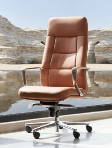
Brown might seem like a colour that fades into the background, but it’s actually a symbol of strength and professionalism. A warm shade of brown makes a great backdrop, especially when paired with vibrant colours like red or teal green. It helps balance out the brightness, so the colours don’t overwhelm the room. Brown isn’t boring—it’s the natural backdrop for the beautiful greens and blues of nature!
GREY🤍

Grey is often seen as a depressing or dull colour for offices. But, like brown, it’s actually quite useful. It can contrast well with bright colours or tone down a space that’s too colourful. Too much grey can be overwhelming, but in the right amount, it’s the perfect balance. It helps soothe tired eyes and calms nerves in a bright, busy environment.
Workplace,It’s important for employers to incorporate their brand into the office, but if your brand colours don’t match the working environment, it can cause problems. Instead of focusing only on brand colours, think about the feeling you want in the office. Choose colours that match that feeling, and find subtle ways to add your brand through textures, artwork, or small touches. This way, your office supports your employees instead of distracting them.
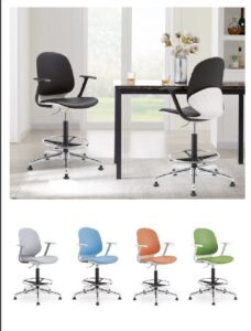
That’s why our star product, the Leion office chair, comes in a variety of colour options to match your workspace. Not only do our chairs offer ergonomic support for your comfort, but our PU series can also be customised in various colours to suit your preferences. With HaHoKa Seating Chair solutions, you can create a vibrant and comfortable work environment that meets your needs and reflects your unique style in the workplace .

workplace